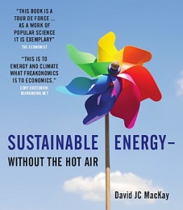
 This past week I was fortunate enough to see a presentation given by David MacKay, Chief Scientific Advisor at the Department of Energy & Climate Change (DECC). Author of the acclaimed book Sustainable Energy – without the hot air (available for free online), Prof MacKay is a font of knowledge and scientific rigour when it comes to the hard questions of climate change and the options available at personal, collective and government policy levels.
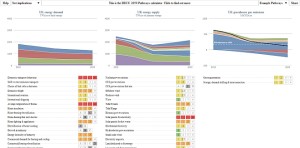
Running through some of the numbers is always an eye-opening exercise, and there are plenty to mull over in the text of his book. There were some rather humbling views for the more environmentally aware on just what it would take to power a country such as the UK with biofuels or solar panels using current technology (answer: an amount of physical space the size of small countries, not to mention the cost and infrastructure requirements), as well as a call for politicians and the media to operate off a numbers basis rather than a rhetorical one. The real purpose of the lecture, however, was to present a rather fantastic tool which has been developed by DECC to help people visualise and contemplate different possibilities to meet carbon reduction quotas by 2050.
The 2050 Pathways calculator is an impressive piece of open-source kit, allowing you to prioritise different avenues for both energy consumption and supply in an attempt to meet current emission reduction targets – “showing the benefits, costs and trade-offs of different versions of the future“. There’s an impressive amount of data underlying the tool, and thankfully plenty of explanatory links for every item included. As an educational tool on climate change and energy policy it is truly excellent – the number of conversations you could build off of the backs of choices made is practically countless. Unfortunately it does lead to a rather morose realisation that so much needs to be achieved, developed and implemented to even get close to the emissions quotas that you find yourself wondering just how possible it is at all…
Climate change will almost certainly be a devastating component of the 21st century, and the various possible energy crises will lead to additional conflict and destruction on top of that. The situation looks very grim, and that leads to the kind of collective buck-passing and thumb-twaddling that only exacerbates the problem. However, the calculator at least provides us with some data-driven responses that should focus our individual thinking and also educate us in the broader policy decisions in order to encourage us to participate and enter this important societal conversation.
Numbers-driven approaches allow us to circumvent some of the passionate, albeit often useless, rhetoric in order to replace it with more effective means of combating the problem. Prof MacKay gave the somewhat humorous example of a recent government poster campaign that encouraged everybody to make sure their phone chargers, and other such appliances, were switched off at the wall when not in use. This makes for a great poster design, and very easy feel-good wins for us all as we switch off those power points. In the end, the difference per day was about the equivalent of 1 second of driving a car…underwhelming to say the least.
We’re better off encouraging people to walk or ride to the shops rather than drive or, as Prof MacKay gave as an example, decrease the temperatures of our homes by a relatively small amount. When you use the calculator and see the impact that an overall decrease in average home temperatures has over and above almost any other option – it makes it incredibly easy to put on that jumper and turn down the thermostat.
The calculator also makes you think more carefully about blanket statements such as ‘we should just put solar panels on every roof’ or ‘nuclear energy will solve all our problems!’. By providing you with the resources to see the true impact of each approach, both in terms of carbon reduction but also cost, space and innovation requirements, the discussion immediately becomes more nuanced and the weight of decisions immediately more visceral.
 There’s a great example here of the importance of data-visualisation, and I’ve discussed before how important such an approach will be over the coming decades. Our capacity to collect, share and analyse data is growing exponentially; but it is very difficult for people to engage with findings unless they are accessible and help clarify things like scale (millions, billions, trillions…there’s really quite a big difference!) and display things in relation to one another.
The kinds of interactive, dynamic data-visualisation represented by the 2050 Pathways calculator should be applauded for bringing us into contact with the very difficult policy decisions that must be made over the coming decade and beyond in such an accessible and impacting manner.
Conversations change society, and by enabling people to enter into conversations on climate change with insight and a solid foundation of the options available is certainly a vital aspect of the overall path to overcoming and/or dealing with climate change that we are going to have to walk together. Have a play around with the 2050 Pathways calculator and share it with your friends, see what plans they come up with and the discussions that emerge as you try and balance one set of sacrifices over another; with the entire process occurring upon the backdrop of a possibly cataclysmic shift in how we relate to the ecosystem that we rely so very much upon.
If you discover some magic balance of solutions let us know by commenting below! What areas did the calculator make you consider more deeply then before?


