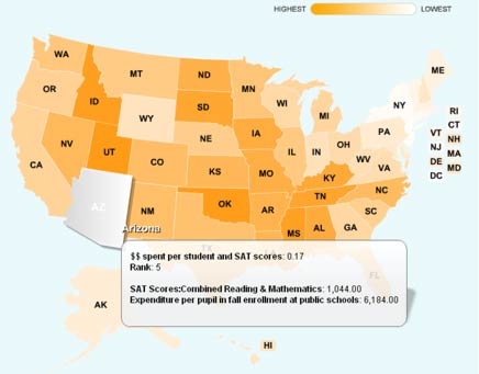
This mashup shows the correlation between SAT scores divided by $$ spent per student
I found this over on ReadWriteWeb, and it is a very interesting example of future transparency and accessibility of government data and statistics.
The post over there highlights the recent Sunlight Foundation, Apps for America 2: The Data.gov Challenge and describes some of the place winners for the competition. There are some great applications there, and it’s well worth a read.
What I want to focus on now though was the eventual winner – DataMasher – a fascinating programme that allows users to combine different sets of statistical data to examine geographical correlations between them.
You first pick a data set – such as violent crime rate, poverty levels, SAT scores, CO2 emmissions, political contributions and many many more. Then pick an operator (add, subtract, multiply, divide); and then another data set. The mashup then displays the results of this equation on a colour-coded map of the different US states, showing you the highest to lowest results.
It’s a great example of putting government statistical data into the hands of the population (and, indeed, a global population). It allows everybody to join in on the discussion of analysis of different comparisons, and at the very least brings up so many topics of conversation and debate that the impact of stirring up such thinking alone is worth the experiment. It is a great example of increasing government transparency and allowing all of us to have a better idea of the state of the society that we live in.
Admittedly, the results can sometimes be a bit esoteric to get your head around – particularly when using operators such as add or subtract (divide seems much more intuitive, with a simple example being an item divided by population). However it is certainly an interesting site to spend some time playing around with.
I definitely recommend you give it a shot, and if you come up with any particularly interesting (or surreal) correlations let us know here!


